

Prototype
Overview
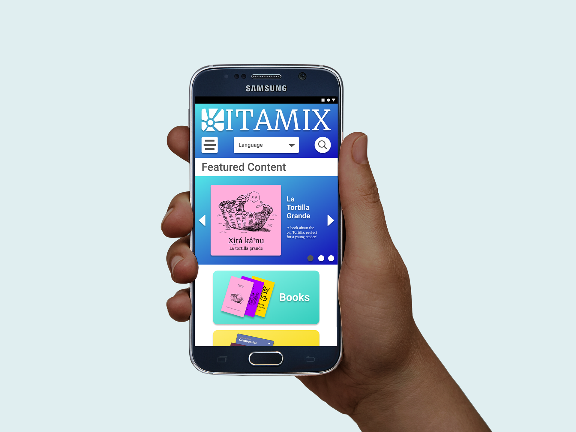
A Mobile-First Library System Putting Native-Language Reading Materials in the Palms of Mixtec Speakers.
Role
I was the sole UX/UI Designer, I worked with the client to gather research data, worked with mentorship to get outside opinions and feedback, and then extracted pain points, insights, priorities that all fed the ideation and the first MVP leading on to usability testing, which I then conducted and analyzed to plan next steps. Branding and visual language was established in conjunction with client inspiration.
Problem
Linguists in the Southern Oaxaca area are preserving the Mixtec language and culture through literacy work, but there is no digital tool for Mixtec Speakers to access the materials that have been created.
Audience
The small Southern Villages of Coicoyán and San Martín Peras, limited to the few Western Juxtlahuaca Mixtec-speaking villages.
Solution
I created a mobile-first platform that allows Mixtec speakers to download materials to their phone to use with their e-reader app
I executed this project over a 2 week sprint.

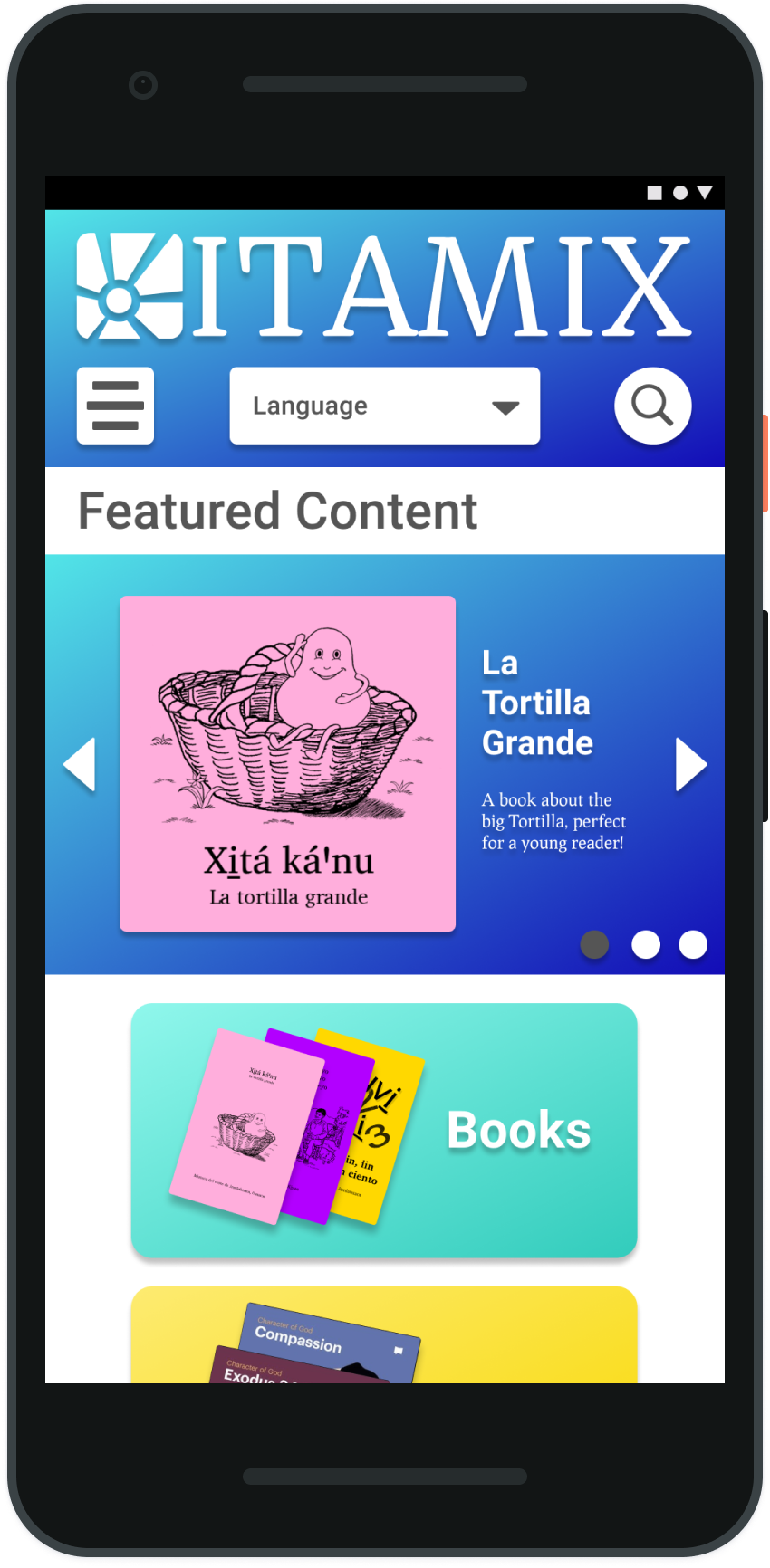
Home Page
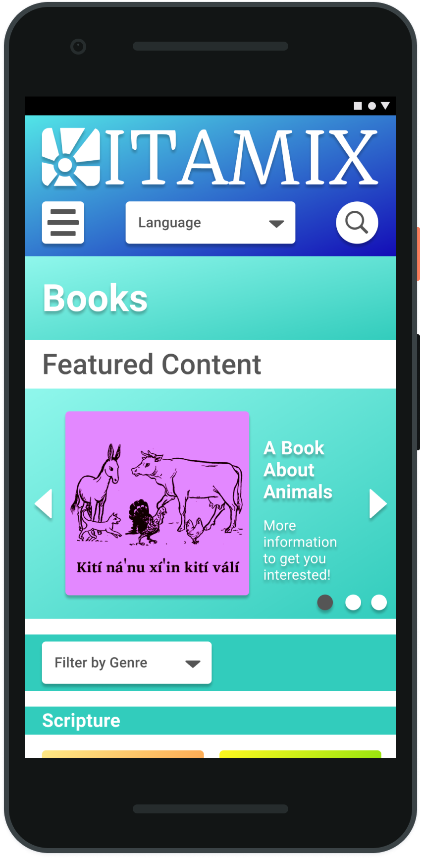
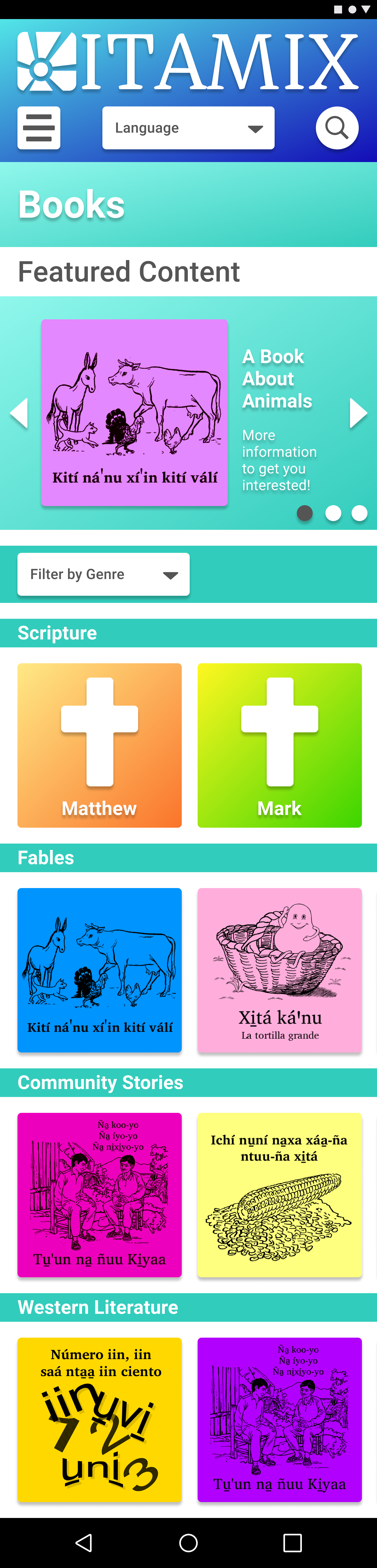
Books Page
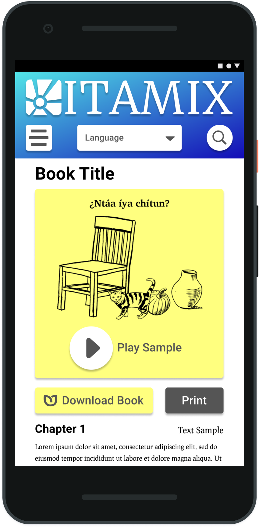
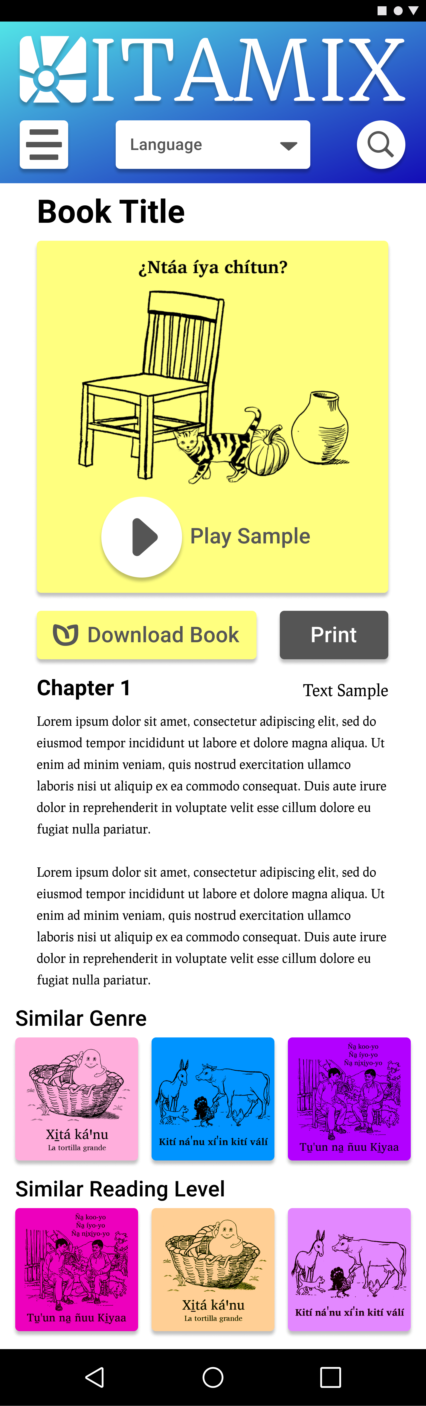
Single Book Page

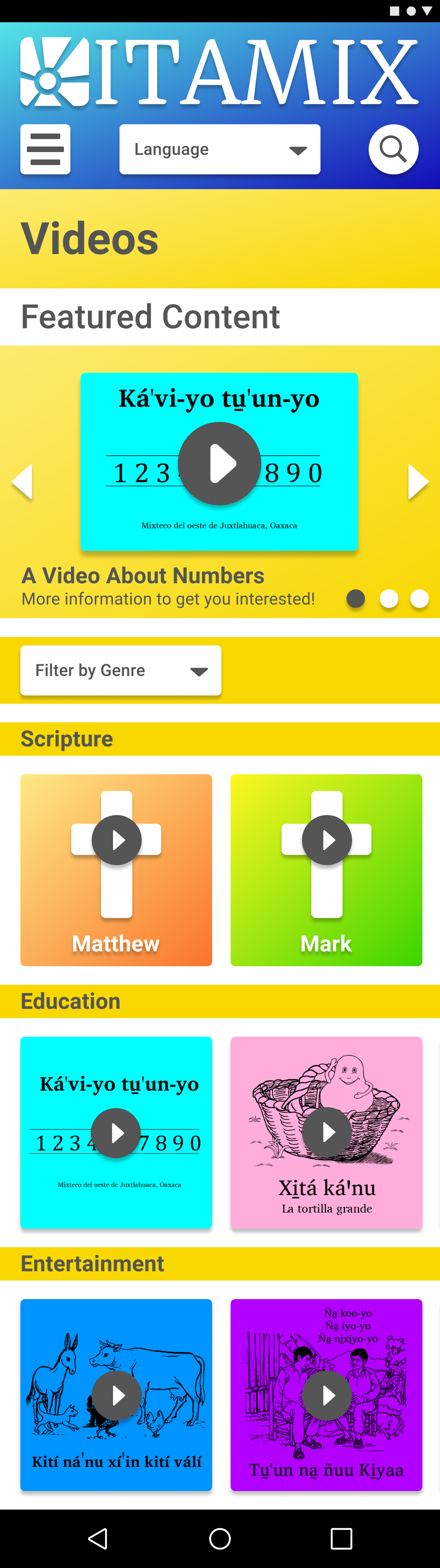
Videos Page
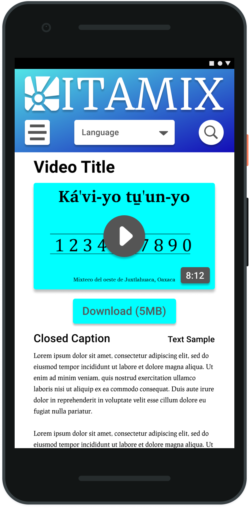
Single Video Pagae
Process
Discovery and Research:
I interviewed the client who has done extensive ethnographic research for 15+ years of watching multiple families in the area, building deep relationships with 20+ families in the area. We discussed their insights and gathered as much information as we could about the habits and statistics of the population.
Coicoyán Population Information San Martín Peras Population Information
The research began to center around a need for a hub that was simple to use for a tech-illiterate population. It was clear that there was a wealth of material, but introducing reading materials, as well as videos and other media had to be presented in a captivating way to a population without reading in their cultural vocabulary.
The research began to center around a need for a hub that was simple to use for a tech-illiterate population. It was clear that there was a wealth of material, but introducing reading materials, as well as videos and other media had to be presented in a captivating way to a population without reading in their cultural vocabulary.
Pain Points
Limited access to the internet, limited ability to read, unfamiliar with reading and what was available, no access to the materials without finding a printed copy at the one office operated by the linguists.
User Goals
Easy access to materials in their own language to learn, to read, and to share their culture and heritage.
Market Analysis: Pinterest and WeTransfer

Strengths
Simple navigation, highly visual interaction, continued updating to allow people to see new and novel content each time they engage with the platform. They allow for a personalized board of interests that guide the things users are shown.
Weaknesses
A lot of content at once can lead to lower commitment levels, a lesser involvement, and the users can skim rather than spending time involving the media. There’s also a possibility that with more decisions the users hesitate and have anxiety.
Opportunities
Streamline content and turn into more systematized silos. Self-published
content from Pinterest would be another opportunity to explore.
content from Pinterest would be another opportunity to explore.

Strengths
Simple interface, the limited options of what the site can do is reflected in how little there is to the site.
Weaknesses
There’s not much engagement or need for repeated returns to the site unless you’re sending lots of stuff. There’s nothing to keep a person there for updated content.
Opportunities
Add content and engagement with more personalized login and accounts
to drive continuous interaction
to drive continuous interaction

Persona #1
Josephina, 23 year old, Female.
She’s a single woman with a close family connection. She’s fairly busy as a traveling merchant with her family. She’d like to become a teacher, so she’s attending classes as she can to work on her diploma. She’s close to her young brother who is 5, and her grandma. She’s fluent in speaking Mixtec and Spanish, her ability to read in Spanish is proficient, and in Mixtec she’s still developing. She does have younger friends who were able to learn more in school about reading in Mixtec and she doesn’t want to feel left out.

Persona #2
Sergio, 28 year old, Male.
He’s an independent man, but he’s also the caretaker for his family. He’s got a brother but he’s the one who provides financially for his family as his parents are aging. He’s a teacher who works in the schools in a nearby village, so reading is something he likes to do to stay connected to home and to keep close to stories he grew up with. He is also teaching in Mixtec, but it’s a separate dialect, so he’s trying to practice that dialect and to encourage his students to start reading for themselves.
User Stories: High Priority Medium Priority Low Priority
As a Mixtec Speaker from Coicoyán I want to pick my language so that I can read the material in my own language.
As a native Mixtec speaker I want to search with as little reading as possible, so that I can find material even if I don't speak Spanish.
As a native Mixtec speaker I want to search with as little reading as possible, so that I can find material even if I don't speak Spanish.
As a new reader I want to find easy material so that I can practice and improve reading.
As an excited reader I want to find shareable things so that I can involve my family as I read.
As someone who pays for internet by the byte I want to know what I am about to read before I download so I can save data cost.
As someone with an entry-level phone I want to see what I am downloading so that I can save space on my phone.
As a member of the Mixtec community I want to see what other people are reading and saying so that I can stay connected to the spreading Mixtec population.
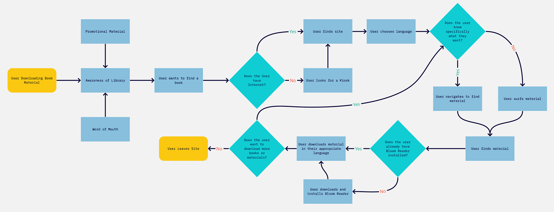
User Flow
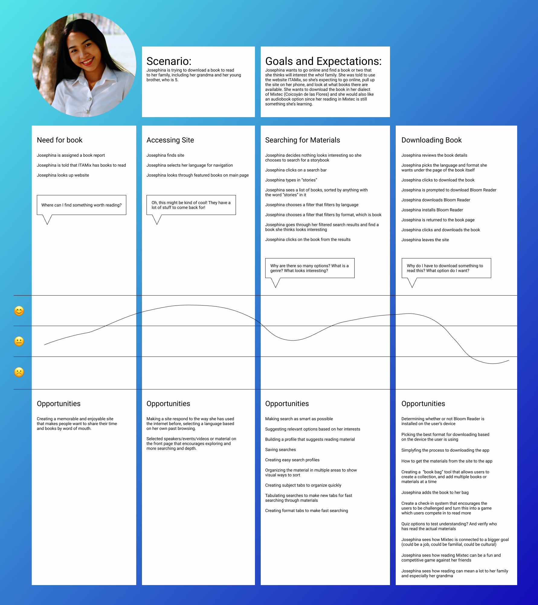
User Journey and Empathy Map

Wireframe Sketches

From Home to Download

From Category to Category

Browsing for Material

Organizing Information

Details of Material

Site Structure and Brand Ideation

Solution Sketch Series Page 1

Solution Sketch Series Page 2
Storyboard

Josephina's Story- I wanted to step into Josephina's shoes for a day, from hearing about ITAMIX from a friend, getting a chance to go to the local Internet cafe, browsing for a book to start reading to her brother, playing a short audio sample for the rest of the Internet cafe to listen along, and finally downloading the book to her phone to bring home and read to her family.
Digital Wireframes

Home Page
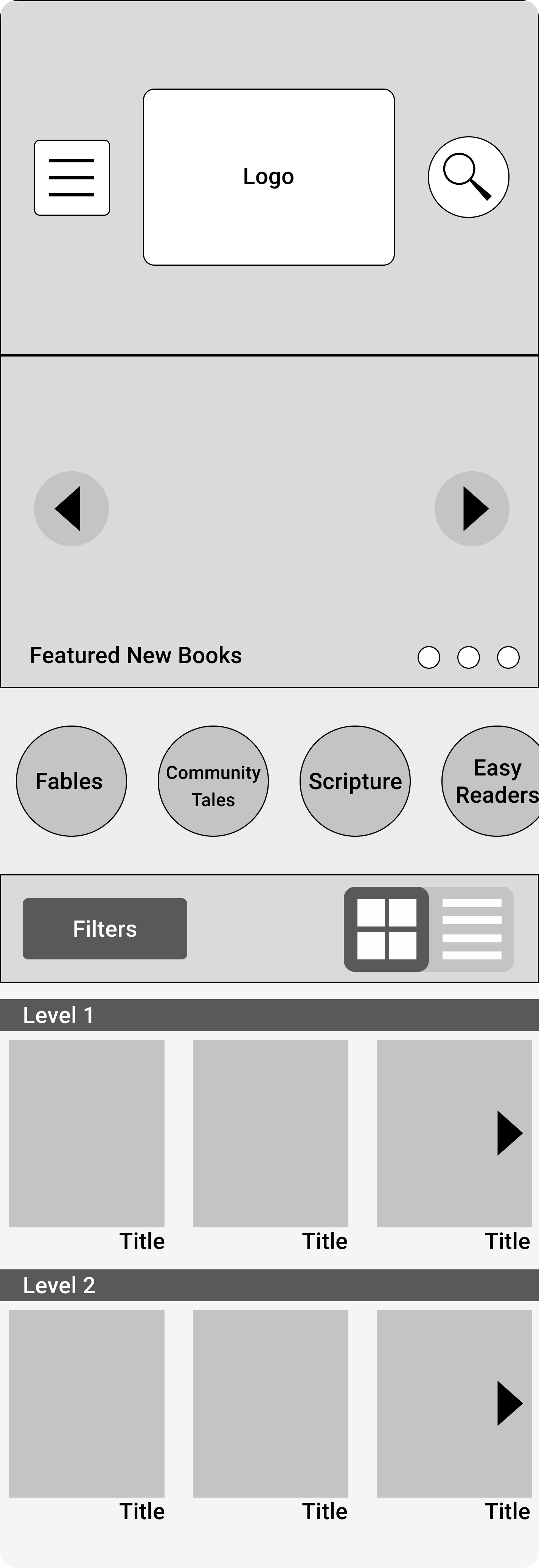
Category Page Sorted by Levels
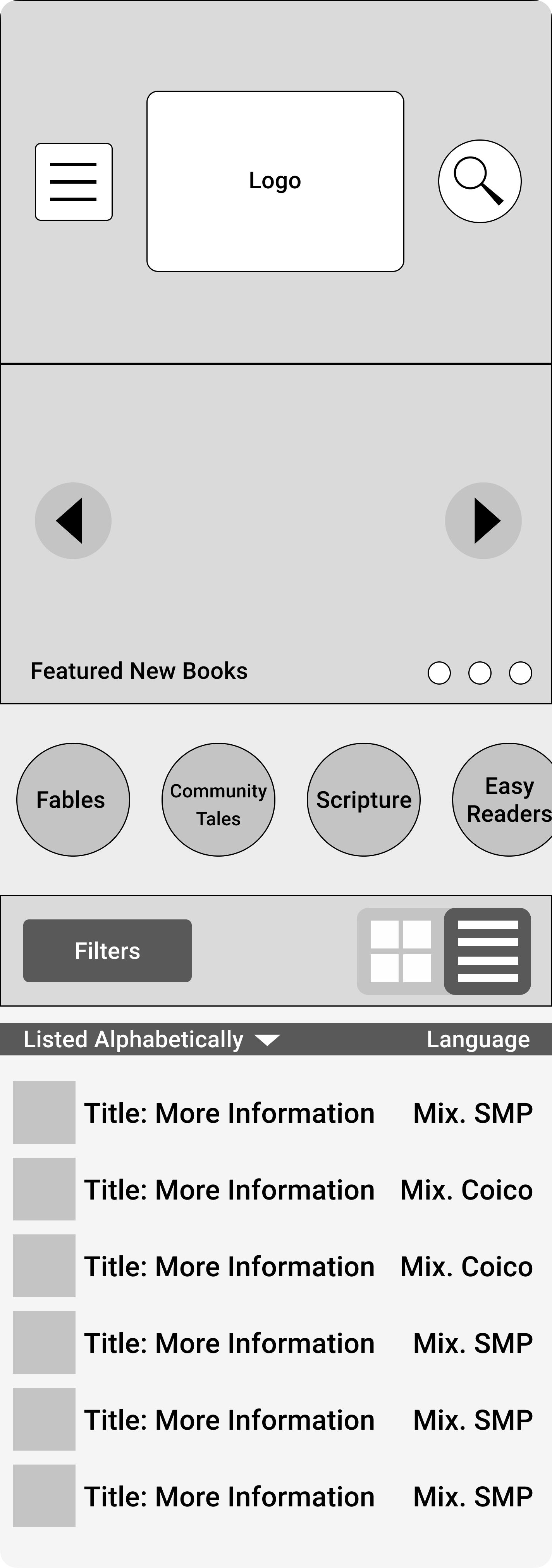
Category Page Sorted Alphabetically
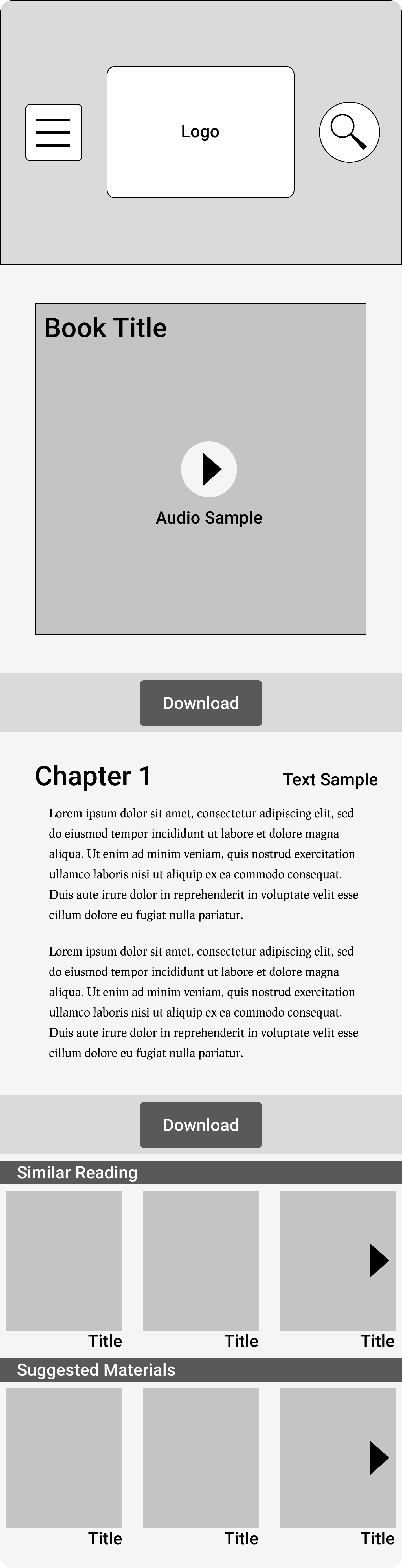
Single Material (Book) Page
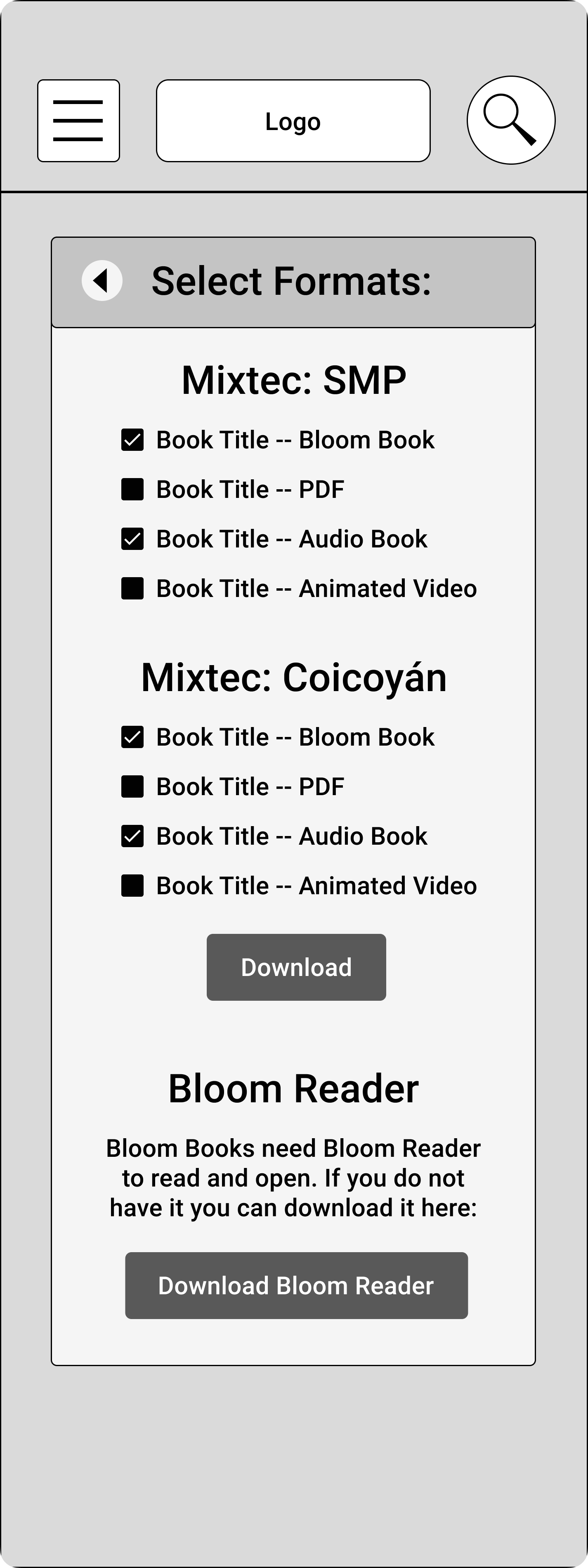
Download Formats and Languages Page
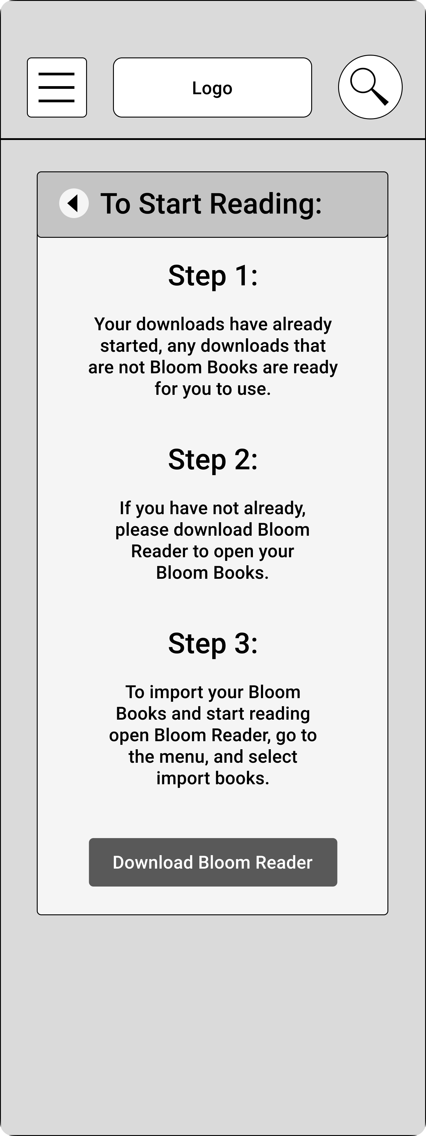
Steps to Download E-Reader
Paper Prototype and Testing
The process of creating the story, defining key features, and then developing screens to guide my design in a rapid prototype allowed me to do some play-testing, running through each step as logically with other stakeholders in person and virtually. Some issues that arose centered around the process of choosing a language earlier on in the browsing experience, so that the users could potentially select a native language for their entire experience. Another key item that needed to be clarified was a way to understandably break down the formats of download. I began to ask myself what the user really needed, and what was too much information for someone like Josephina who wasn't a Digital Native.

Revising the Flow

Revising the Information Architecture

Refining a Page Interaction
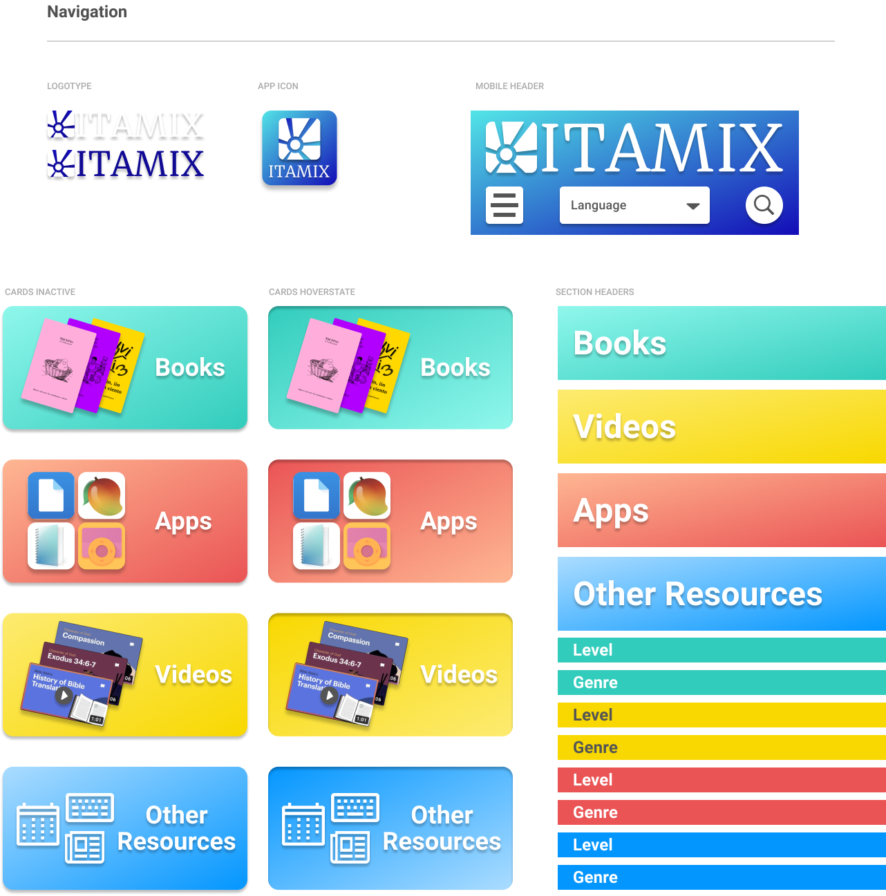
Brand Development:
The next step that was taken on was a full development of a brand language, with UI elements and the corresponding guidance for how to make the Mobile Library look and feel young, trustworthy, engaging, and educationa and accessible for anyone.
● Characteristics
● Mood Board
● Sketches
● Color Palette
● Type
● Logo Design and Process
● Iterations on Visual Design prior to Usability Testing
● Usability Preference Test with Results
Usability Testing

Tasks Tested
Pick a language. the users had to figure out how to navigate and select the relevant language. Find an easy book. Given a loose theme and a target of something that would be relevant for a 5 year old, the users had to find a book that they thought appropriate. Download the book. Users were asked to find a way to download the material they found onto their phone. The users were given some additional parameters about something to consider as a “personal pick” and were asked to find a separate book. Next week update. Assuming the users were on the site I asked them to check out what was new and something that wasn’t a book. Look for Related Content. Users were asked to find more material related to the media they had previously discovered. Finds Something Shareable. Users were asked to find a piece of media that would be relevant to a specific interest and had tools for them to share. Find a Challenging Read. Users were asked to find something more complex, navigating their ability to distinguish difficulty based on the hierarchy of the site. Find something new. The users were asked to find a few different pieces of media related to a specific topic.
Methods
Surveys sent to get contextual and
demographic behaviour. Simulation for users who are difficult
to reach. Usability tests conducted remotely with prototype and recorded to be annotated. Follow-up interviews to get qualitative feedback.
demographic behaviour. Simulation for users who are difficult
to reach. Usability tests conducted remotely with prototype and recorded to be annotated. Follow-up interviews to get qualitative feedback.
Confirmed findings:
●100% success rates on all tasks, direct and indirect
● Genres were effective to navigate
● Levels were an understandable format
● Suggested material was effective in helping find more content in each navigation, as well as navigating to new things
● Playing a sample was a simple and intuitive interaction
● Downloading Bloom Reader was understandable
● Search function became better with time
● Users felt comfortable navigating and looking after a short time using the app
Room to Review:
● Dialect versus “region” clarity
● Distractions in busy lives/more apps lead to distractions around the downloading steps
● Steps for Bloom Reader import were not easy and frustrated multiple testers
● Users wanted the click after the download book to be the book itself
● The rough version of the prototype was unclear for the sliding depending on the format of interaction
● The title bar as the label for the format at the top of the page was the only indication of format and could be missed
● Clarifying where to look for subjects that were available in multiple formats.
Prototype

Home Page

Book Page Sorted by Level
Book Page Sorted by Genre
Book Page Single Book
Video Page Sorted by Genre
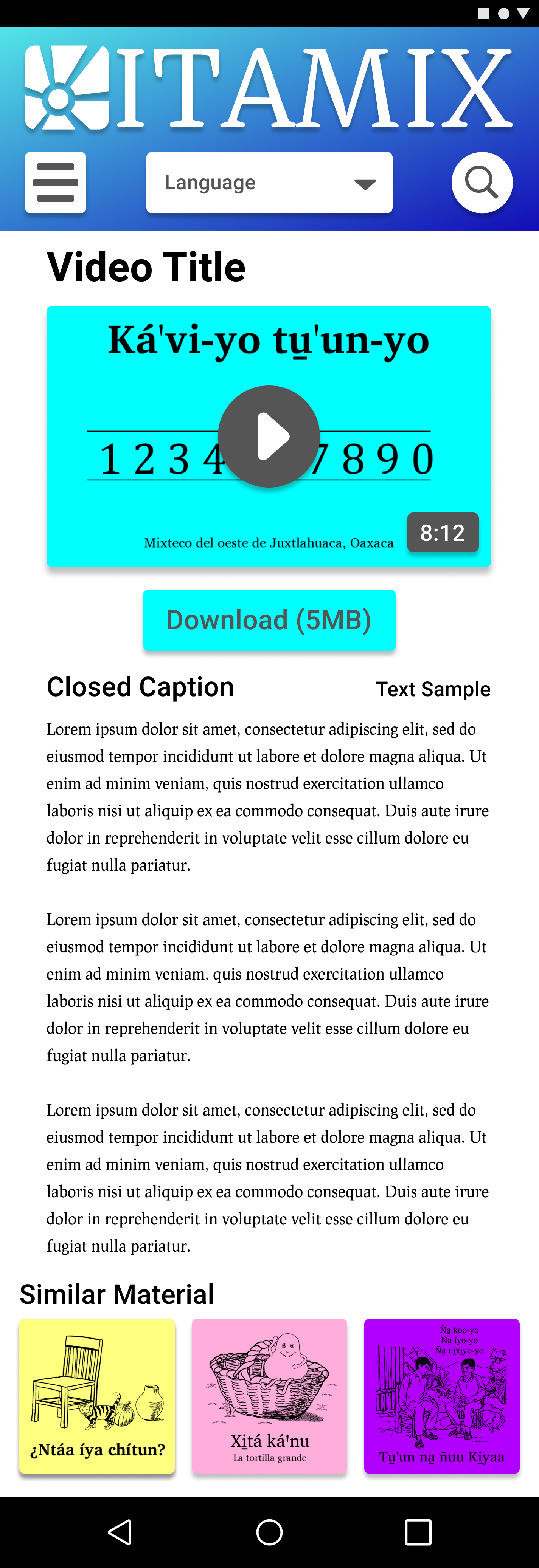
Video Page Single Video
Next Steps:
● Clarify the Meaning of Levels
● A/B Testing Double Download Buttons
● Clarify the Kind of Featured Content
● Animations to Spatially Arrange the Pages
● Simplify switching Genres and Levels
● Further Testing for Scripture Categorization
● Drop-down Feature for Sample Text and Closed Captioning
● API interaction between the site and the integration to Bloom Reader
● Personalized Login
● Community Contributions
Learning Opportunities
● Being Specific in Tests for Usability
● Establishing a Visual Identity Early
● Recording Interviews to Optimize Tests with a Limited Team Size
● Outside Input as Early as Possible
